
ND – Absolutely “H”issing it down, Blue
The works of…
Mark Rothko are dominated in the public conscience by his signature “multiforms” which he developed during the mid 1940’s.
So ingrained and recognizable is this painting style that there are even popular Flickr groups dedicated to emulating his work, though with somewhat dubious success in my opinion.
The abstract nature of Rothko’s multiforms, though distinctive, can also make them inaccessible to many as their general pattern of ill-defined basic geometric shapes (rectangles and squares largely) superficially have no connection with daily life and are hard for some to connect with.
However, the simplistic aesthetics of various multiform examples have made them a necessary staple for many an arty study wall adorned with posters in homage.
The question here is “Can this style be replicated in-camera?”
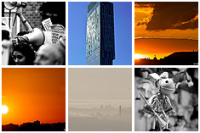
 Rothko Homage 1 Yellow
Nikon D80 'DX', Tamron 28-300mm F3.5-6.3 AF XR Di LD IF @ 110mm, Exposure 1/3 @ F5.6, ISO 500, Delineated areas of colour with graduated shade and tone give a Rothko-like appearance
My dining room walls are yellow, and the ceiling white. In one corner I have a shaded floor standing lamp with a single yellowish CFL bulb pointing up through a hole in the top of the shade. This photo is of the wall/ceiling corner above the lamp. The semi-shaded light mixed with the different angles of the three surfaces produces the graduations in tone, and the yellow walls and bulb fill the white ceiling with a strong yellow glow.
If you don’t know what this image is, then it’s quite hard to tell. However, I wasn’t fully happy yet as I knew what the image was and to me it didn’t feel abstract enough yet.
So…
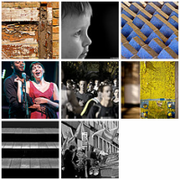
 Rothko Homage 2 Yellow
Nikon D80 'DX', Tamron 28-300mm F3.5-6.3 AF XR Di LD IF @ 300mm, Exposure 1/1 @ F6.3, ISO 320, Compared to the previous shot I have zoomed in, manually defocussed, and slowed the shutter to allow deliberate mechanical blur during the exposure
This image appears to be just two areas, with a curved graduated shift in colour and tone between them. However, the subject here is actually the same subject as the first image above, but with changes to the way it was shot.
I zoomed in, but more importantly I disabled autofocus and manually defocussed the scene quite heavily. I also slowed the shutter down so that I could deliberately move the camera during exposure in order to implement a mechanical motion blur.
On the whole, I think these images worked well given my intention.
What do you think? Rothko-esque or not?
I’m going to continue to look at this subject and will post new images on my dedicated Flickr Set.
More Rothko homage images are at Part 2, Part 3 and Part 4.
Have abstract fun,
ND
![]()
![]()
![]()
(c) Nakedigit 2010


Pingback: More Rothko… | Nakedigit
Pingback: Rothko 3 – Even More Rothkoesque | Nakedigit
Pingback: iPhone 3GS vs Rothko – Rothkoesque 4 | Nakedigit